Making protein bars pop in a sea of rainbow-coloured chaos? Challenge accepted! 🌈✨
The Food Doctor came to us with a clear mission: help their protein bars stand out on
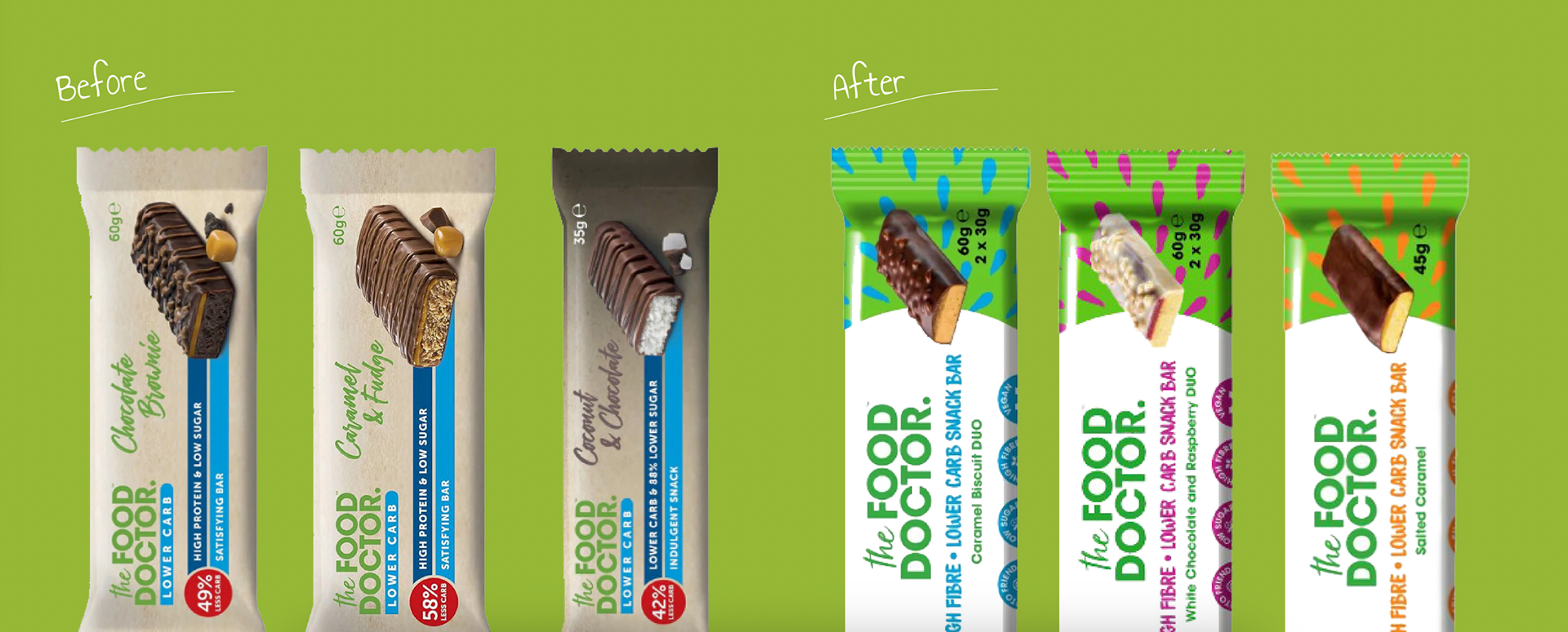
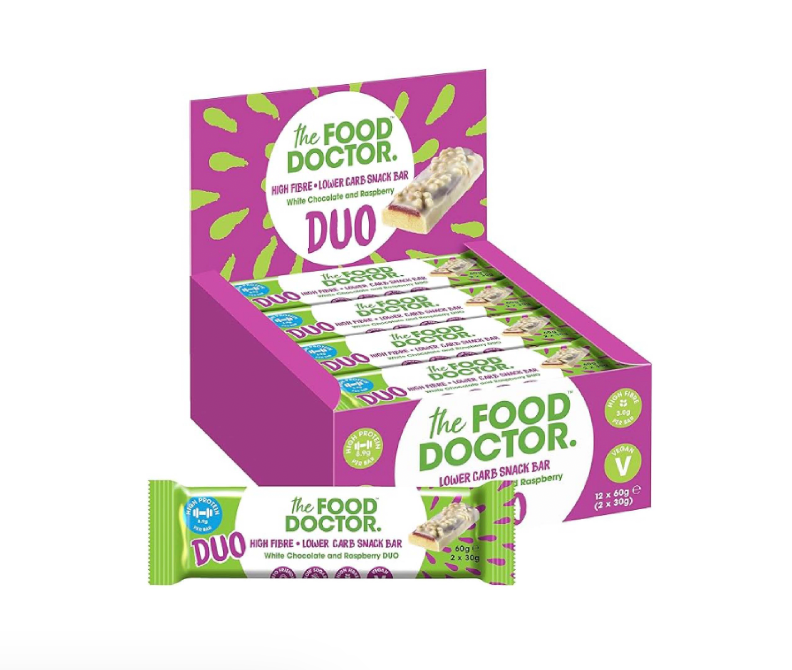
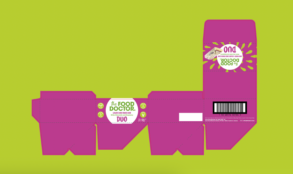
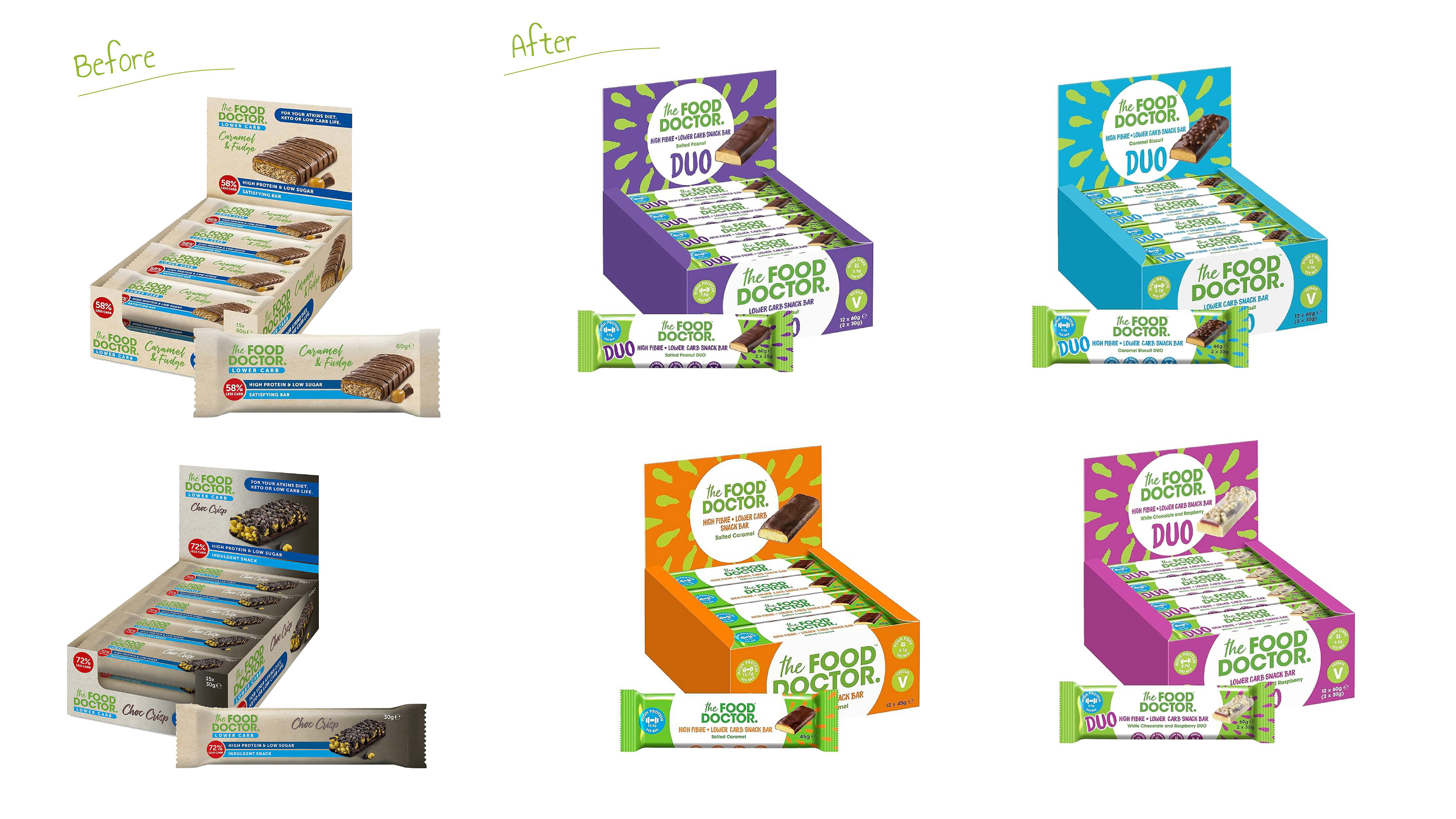
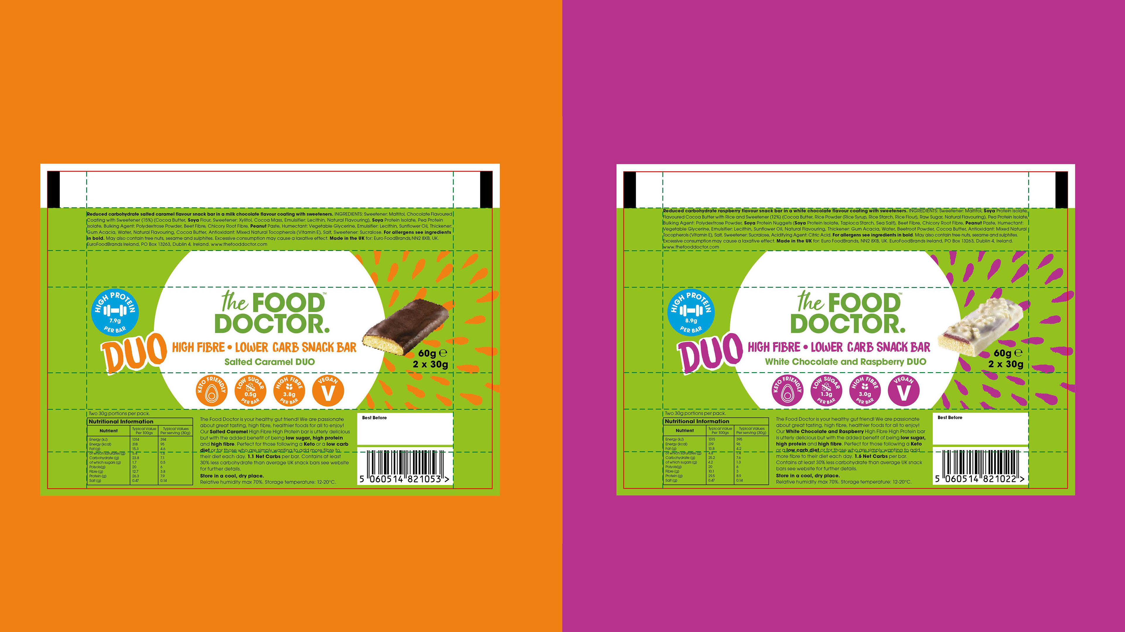
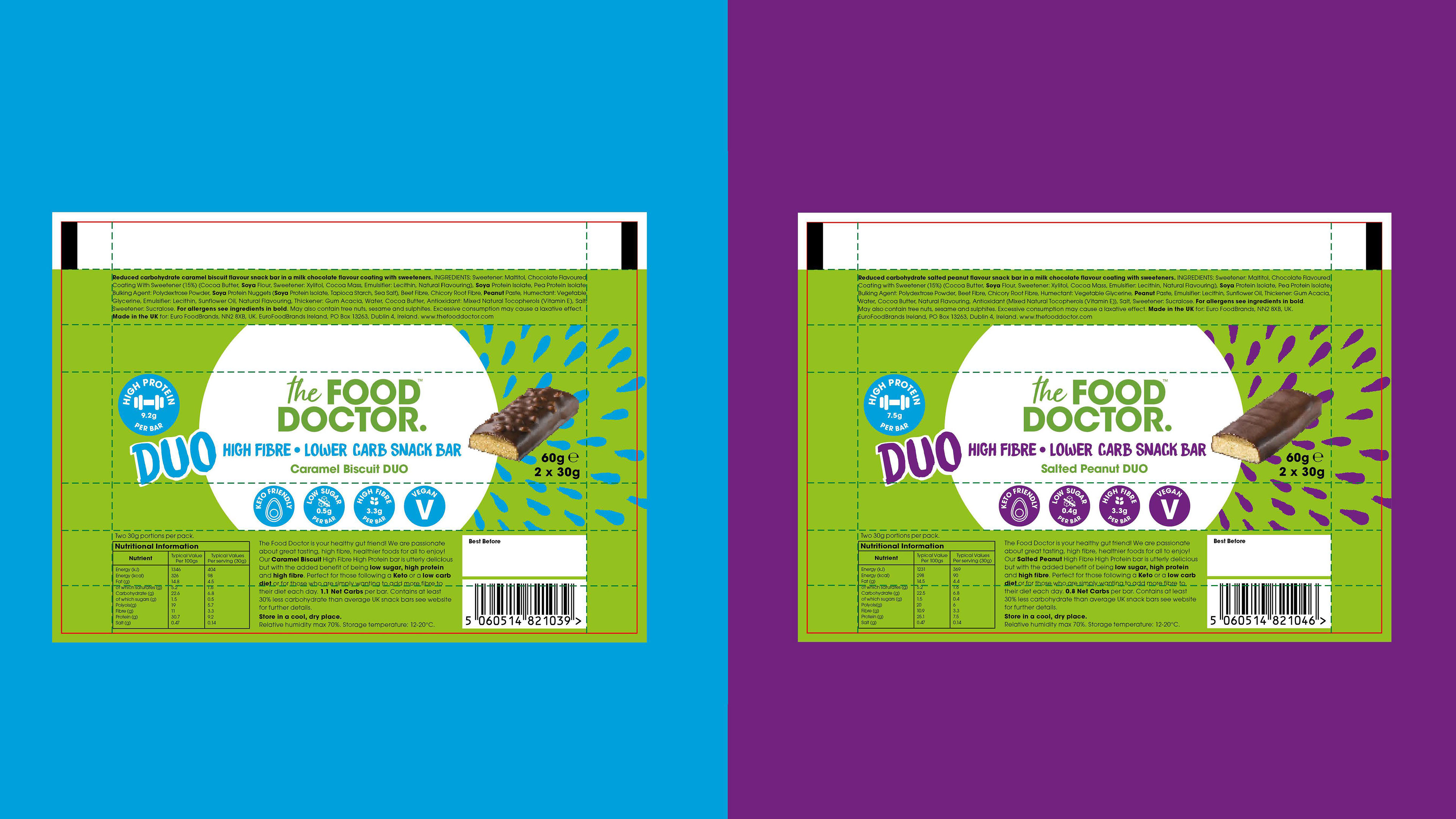
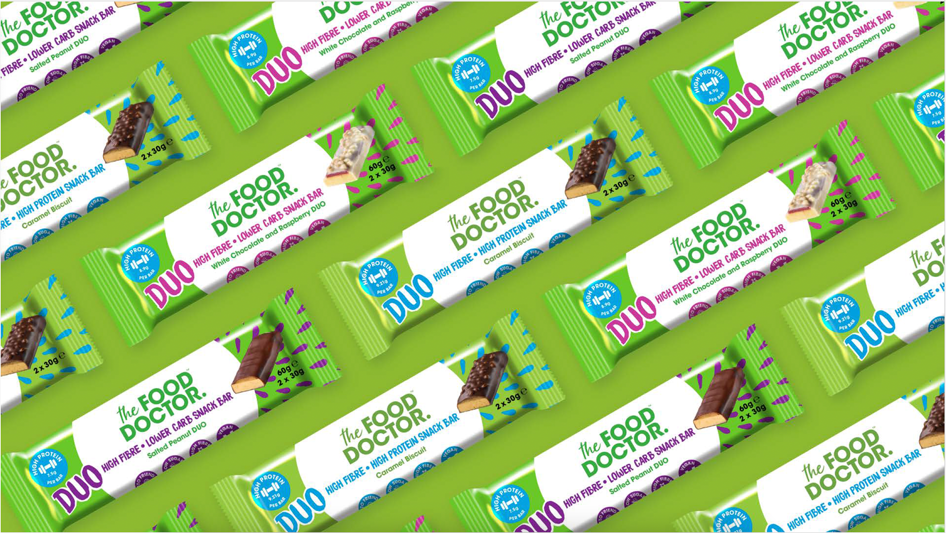
crowded shelves. Their old packaging was getting overlooked and lost in with the sea of bright, rainbow-coloured bars in the market. They wanted something vibrant and eye-catching but still trustworthy and aligned with their brand. Taking inspiration from their updated product packaging, I worked closely with a senior designer to create a fun and inviting new look. We used a bold green base with vibrant accent colours for each flavour, and the results were amazing—the new packaging stood out dramatically on the shelf!
crowded shelves. Their old packaging was getting overlooked and lost in with the sea of bright, rainbow-coloured bars in the market. They wanted something vibrant and eye-catching but still trustworthy and aligned with their brand. Taking inspiration from their updated product packaging, I worked closely with a senior designer to create a fun and inviting new look. We used a bold green base with vibrant accent colours for each flavour, and the results were amazing—the new packaging stood out dramatically on the shelf!
